
Start with the ground.
A simple word with a direct connection to the work. Early explorations looked for a name that felt familiar, useful and full of possibility.
Early concept / part of the story Back to Dirt World
DIRT WORLD / BRAND STORY & GUIDELINES
A name rooted in land. An identity built around people. A practical, visual guide to the story we share and the way we show up.
Edition 02 · November 2026 · English
GROUNDED. WARM. PRECISE.Land. Work. People. Possibility.
Dirt is where things begin. It is the ground beneath a neighbourhood, the material beneath a foundation and the path that takes us somewhere new.
Founder Sean Young wanted an identity that could make a serious business feel approachable. A name with a connection to the work, and enough room for a family of businesses to grow around it.
For Dirt World, that means recognising what an owner has built and helping them find a good next chapter. Across the Dirt family, the same name connects places, ideas and the people who bring them to life.
A simple word with a direct connection to the work. Early explorations looked for a name that felt familiar, useful and full of possibility.
Early concept / part of the story
Dirt Lot Listing Service gave the idea an early commercial expression, connecting residential land with homebuilders and developers.
Original ink-and-gold artworkThe name grew into a shared identity for Dirt World, Dirt Lot Listing Service and Dirt Studios. Distinct purposes. A familiar character.
Current white-and-gold expressionA PATH WORTH TAKING
“Of all the paths you take in life, make sure a few of them are dirt.”
We like the invitation in those words: stay connected to the earth, leave room for discovery and make a path of your own.
A popular saying often attributed to John Muir; its exact source is uncertain. Attribution note ↗
The Dirt name can connect a group without making every business the same. Keep each business name and role clear.
A shared name and visual characterThe group and its acquisition program. A thoughtful next chapter for specialist practices.
The Dirt name extended into places for work, connection and collaboration.
A land-focused expression of the brand, connecting the name to residential lots and the work of building communities.
Each business keeps its own name and purpose, with a shared sense of where it belongs.
Lowercase, confident and familiar. The final dot belongs to the artwork. Use the supplied files, preserve their proportions and choose a treatment that holds its contrast.
White + gold / forestExplore a background
The paper treatment uses the original ink-and-gold artwork. The one-colour treatment follows the current green footer expression.
Keep at least one final-dot diameter clear on every side. Measure from the visible artwork, and leave more room whenever the composition allows.
240 px / generous display160 px / everyday use100 px / digital starting minimumKeep the full mark horizontal and proportional. Begin at 25 mm wide in print; proof the final output. The browser icon serves a different, smaller role.
Let paper and green do most of the work. Gold marks a useful action or a moment of warmth. The palette should feel confident without becoming loud.
#21382A#ECEEDF#F6F4EB#EDC74E#EBB001Upright. Clear. Thoughtful.
One idea at a time.
We’re interested in the specialist work you do and the relationships you’ve built. The words should sound like a capable person paying attention.
Let translations find their own line breaks. Keep accents, punctuation and meaning intact.
Illustrative applications for teams, partners and designers. A consistent identity, adapted to the place where people meet it.
DIRT WORLD INCORPORATEDA PERSONAL INTRODUCTION
You’ve built something meaningful.
Let’s talk about what comes next.
With care,
The Dirt World team
A good next chapter.Room for a new conversation.Stationery: clear margins, quiet alignment and a small identifying mark. Use approved contact details in production.
What we look for Our approachThe work. The relationships.
The next chapter.

Clear copy, familiar navigation and room to read.
Let’s talkWeb: keep the same character across desktop and mobile. Reflow the composition; don’t shrink the whole page.
Lead with one message. Leave a calm area for the mark, keep words readable and let the format change the composition.
Good things
start from the
ground up.
Room for
a different
path.
A conversation.
Then a plan.
Use the visual family to support the message. Establish the world once, then move closer or quieter. Each image should earn its place.
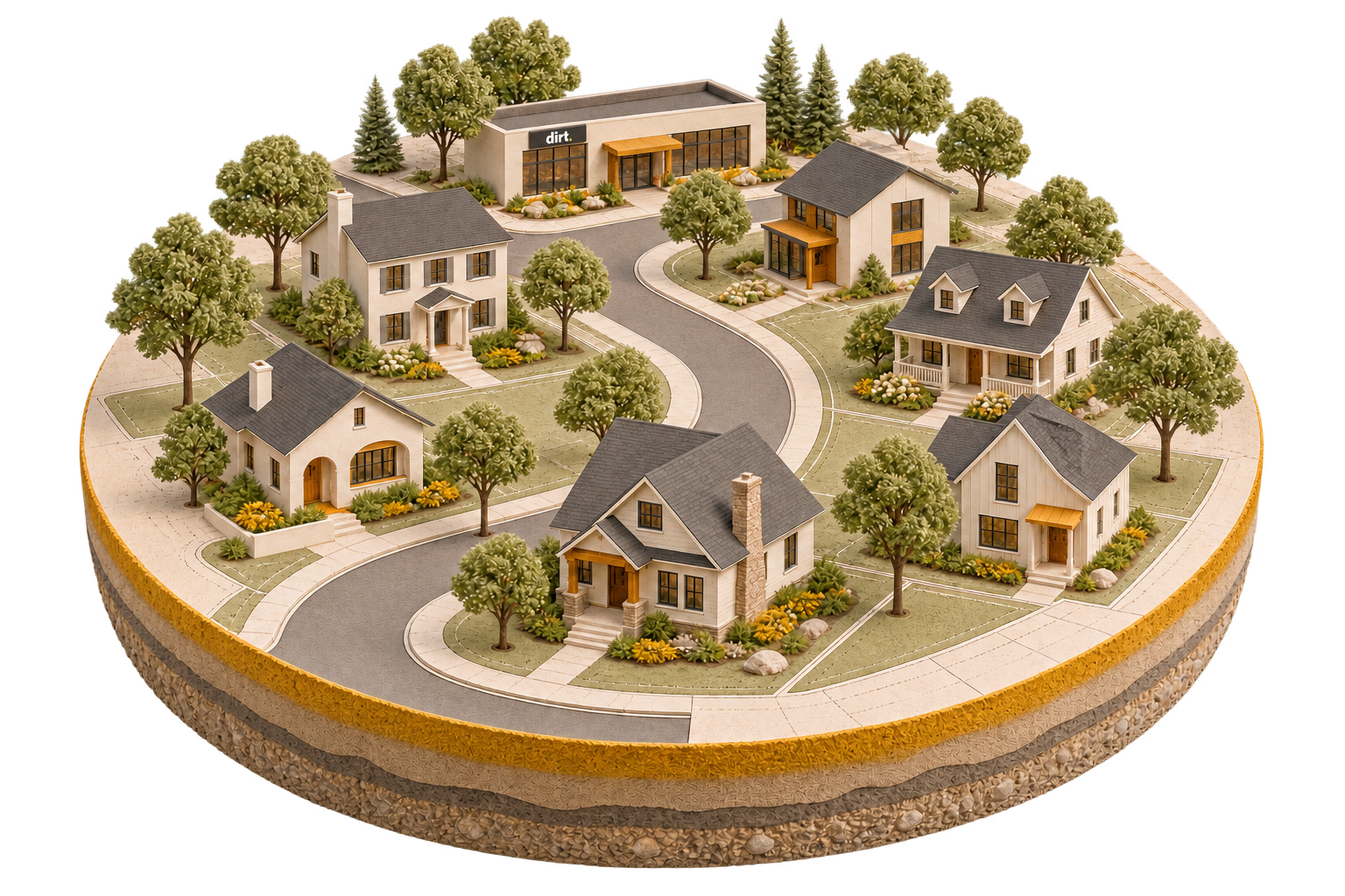

Illustrations express the brand. They are not documentary photographs of acquired firms or an actual property portfolio. Investor communication uses the same identity with a more restrained, information-led expression.
Dirt World brings an operating perspective to the acquisition of architectural controls, plan review, and related permitting practices in the United States and Canada. Our identity makes that focus clear while giving owners room to consider what comes next.
We speak to the person behind the practice. The relationships they have built, the work their clients rely on, and the future they want deserve attention. Our design feels grounded, warm and precise: familiar neighbourhoods, quiet terrain, generous space, strong typography and a small, distinctive gold point.
Use this guide when creating Dirt World websites, presentations, correspondence, social content, publications and partner materials. The voice stays consistent; the amount of detail and degree of formality change with the situation.
| Name | Use |
|---|---|
| Dirt World | The everyday brand name in headings, navigation, conversation and editorial copy. |
| Dirt World Incorporated | The full corporate name in formal identification, publication credits and corporate footers. |
| dirt. | The supplied visual wordmark. Its lowercase lettering and final dot are part of the artwork. |
| Dirt World acquisition program | A descriptive name for the acquisition activity; use sentence case. |
Write “Dirt World” as two words with initial capitals. Do not translate the name. Use the full corporate name where the identity of the entity matters. The logo does not change the spelling of the company name in ordinary text.
Dirt World, Dirt Studios and Dirt Lot Listing Service are related expressions of the Dirt name. Use each name with a clear description of its purpose and an accurate account of what is operating.
The group identity is distinct from each operating business. Preserve E2 + Associates, Summa Consulting and Streetscape as separate names and identities. A group relationship is not a reason to redraw their logos or make every company look like Dirt World. Use legal names from the relevant company’s current approved corporate materials when a legal name is required.
Think of a thoughtful operator sitting down with the owner of an established practice: attentive, familiar with the work, direct about the next question and comfortable leaving room for an answer.
| We are | We are not |
|---|---|
| Attentive - start with the owner’s goals and listen carefully. | Presumptive about why an owner wants to sell. |
| Knowledgeable - name the specialist work plainly. | Broad, generic or inflated in our claims. |
| Practical - explain the next step and what it involves. | Vague about how a conversation becomes a plan. |
| Respectful - recognise the value of a small practice. | Dismissive of a business because of its size. |
| Warm - make a serious conversation approachable. | Overfamiliar, sentimental or playful at someone’s expense. |
| Measured - distinguish possibilities from agreements. | Promising a price, outcome or timetable before understanding the business. |
Attentive. Use questions and invitations that leave the owner agency. “Start with the future you want” puts their priorities first. Avoid telling someone that retirement must be their goal.
Knowledgeable. Say “architectural controls, plan review, and related permitting practices” rather than “great businesses in exciting sectors.” Explain regional terminology when necessary.
Practical. “A conversation. Then a plan.” gives the reader a comprehensible sequence. Follow a warm headline with the work involved: responsibilities, communication, information sharing and handover.
Respectful. “Small can be a very good fit” recognises specialist knowledge and relationships without inventing a minimum scale.
Warm. “You don’t need a polished sales deck” makes the starting point approachable. Use practical reassurance that reduces unnecessary formality while respecting the decision.
Measured. Describe what can be explored and agreed. The website explains that price, timing and continuing roles depend on the business and the transaction. Carry that precision into every channel.
Primary message: We buy architectural controls and plan review businesses, and help owners plan what comes next.
Supporting description: Dirt World’s acquisition program focuses on architectural controls, plan review, and related permitting practices in the United States and Canada. Conversations can begin with a whole practice, a service line or an established book of business.
Short group description: A group built around the work that shapes communities.
These descriptions follow the acquisition website’s hero, business-fit section and footer. Keep the specialist focus visible; “we buy businesses” alone loses useful meaning.
| Message pillar | What to communicate | Useful website language | Where it belongs |
|---|---|---|---|
| Knowledge of the work | The practice’s actual services and relationships matter. | “A buyer who knows your business.” | Introductions, campaign headlines, fit descriptions. |
| Meaningful small practices | Specialist knowledge can sit within a one-person practice or a small team. | “Small can be a very good fit.” | Owner outreach, qualification and FAQs. |
| Succession with care | The owner’s goals and the continuity of the work belong in the discussion. | “Your practice deserves a succession plan.” | Succession content, presentations and longer stories. |
| A workable transition | Learn about the business before setting terms or a handover plan. | “A conversation. Then a plan.” | Process explanations and follow-up. |
| An owner’s next chapter | Retirement, a different role and a new focus are all reasons to begin. | “Sell your practice. Shape your next chapter.” | Calls to action and owner-focused content. |
Use one lead message at a time. Add evidence or an explanation before introducing another. The neighbourhood illustration can carry a sense of community; the words must still say what Dirt World does.
The primary acquisition-site mark is the supplied dirt. wordmark: white lowercase letters with a gold final dot. Use the original artwork. The final dot is an integral part of the mark, not optional punctuation.
The acquisition website also uses a single-colour deep-green treatment on its light footer. Use a supplied, checked monochrome export when one is available. The original ink-and-gold export can be shown on light surfaces as an identified source variant. The white-and-gold mark remains the primary acquisition-site treatment. Do not redraw the mark or assume a new master format exists.
Do not retype it, alter the letter spacing, separate the dot, stretch it, rotate it, add an outline, place it inside a new emblem or apply decorative effects. Do not place the white lettering directly on cream. Avoid textured or high-detail areas behind the mark. Keep company marks separate rather than joining them into a new combined logo.
The palette combines warm paper, quiet greens and deliberate gold accents. Use light surfaces for reading, deep green for structure, and gold to mark important moments. Gold should be purposeful; it does not need to appear on every component.
| Colour | Digital value | Principal role |
|---|---|---|
| Paper | #F6F4EB | Main reading surface. |
| Cream sage | #ECEEDF | Hero and generous introductory surfaces. |
| Forest ink | #21382A | Primary text on light brand surfaces. |
| Deep forest | #263D30 | Dark sections, timeline and strong panels. |
| Charcoal ink | #151913 | High-contrast text and text on gold. |
| Dirt gold | #EBB001 | Logo dot and primary action accent. |
| Warm gold | #EDC74E | The succession/legacy feature section. |
| Terrain paper | #E9E8DD | Footer surface and restrained closing panels. |
| Colour | Digital value | Principal role |
|---|---|---|
| Sage emphasis | #627759 | Large headline emphasis and decorative detail. |
| Muted green | #536348 | Secondary text on terrain paper. |
| Panel green | #314B3B | Layered panels within deep-forest sections. |
| Pale forest text | #F5F3E9 | Text on deep forest. |
| Soft gold | #EDCF68 | Small illustration and FAQ icon surfaces. |
| Quiet line | #D6DBCE | Nonessential dividers on pale surfaces. |
Keep core text in solid colours. Photographic and illustrated lighting can introduce warmer and cooler tones without adding new identity colours.
These ratios apply to the solid pairs shown. Transparency, gradients, images and overlays require a new check. Use Dirt gold as a fill or accent on light surfaces, rather than as small text. Sage emphasis belongs in large display text; use forest ink for small, essential text.
Hex values define the digital palette. For print, make a colour-managed proof on the intended stock. Choose any spot-colour or CMYK match from that proof rather than treating a screen conversion as an exact physical match.
Manrope is the display and heading family. DM Sans is the reading and interface family. Use Arial or a system sans-serif as a fallback when the brand fonts cannot be loaded. Obtain fonts through their official distribution and follow the licence included with the font files.
| Role | Family and weight | Working scale | Treatment |
|---|---|---|---|
| Main hero | Manrope, 650 | 43-66 px on broad screens; roughly 35-49 px on small screens | Short, upright, tightly composed. |
| Section heading | Manrope, 650 | 38-64 px, reduced as the layout requires | One idea, usually two or three short lines. |
| Card or subheading | Manrope, 650 | 22-28 px | Direct and sentence case. |
| Introductory paragraph | DM Sans, 400-500 | 18-22 px | Comfortable spacing; supports the headline. |
| Body | DM Sans, 400 | 16-18 px, line-height 1.6-1.8 | Left aligned; clear paragraph rhythm. |
| Labels and captions | DM Sans, 600-700 | 12-14 px | Brief; use capitals only for short labels. |
| Controls | DM Sans, 600-700 | 14-16 px | Clear verbs and sufficient room around the text. |
The acquisition design uses headline line-height near 1.12 and tracking near -0.055em. Treat these as display settings, not settings for body text. Relax tracking if accents, a translation or a smaller size makes the words harder to read. Use colour or a line break for emphasis; the source design keeps emphasized headings upright rather than italic.
Do not force a heading to match the English line breaks in another language. Keep body lines around 45-75 characters where space allows. Avoid fully justified copy, extended all-capital paragraphs and text embedded inside images.
Build pages from a clear reading sequence: a short context label, a useful headline, a concise explanation, then a next step. Give the main action priority and make secondary links quieter.
Use spacious sections and a limited number of strong panels. The website’s broad content area is approximately 1,220 px maximum width. For new layouts, use an 8 px spacing rhythm, adapting it to content rather than squeezing content into a preset height. Start with 24 px mobile page gutters and 48 px broad-screen gutters; reduce only when the available space requires it.
Rounded corners should feel restrained: about 8 px for compact actions, 12-16 px for panels and up to 24 px for small floating control groups. Use a light rule or a modest shadow to separate layers. Avoid heavy card borders, excessive glass effects and multiple competing shadows.
Design for reflow. On small screens, put the key message and action before optional illustration detail. Stack columns without changing the meaning or reading order. Keep paragraph text readable at zoom and allow labels, navigation and translated copy to wrap.
The distinctive visual world is a carefully made miniature neighbourhood: homes, planted gardens, connected streets and a modest Dirt World office. It connects the specialist work to the communities it supports.
Use warm cream materials, muted planting, charcoal roofs, restrained gold details and believable light. Scenes should feel considered and inhabited, without becoming busy. A wide neighbourhood establishes context; a house or office detail provides a closer, more personal view.
These are illustrative brand scenes. Do not describe them as photographs of acquired businesses, completed projects, actual communities or the company’s real office. Do not add invented client signage, official seals or property claims.
Use real, approved portraits for identifiable people. Retain a recognisable likeness and natural expression. Use a portrait only in its approved editorial context; inclusion on a webpage does not make it a general-purpose stock asset. Never fabricate a person, testimonial or signature to fill a layout.
The existing topographic-map artwork is a quiet brand texture. Use it as a supporting layer, particularly in footers and closing panels. It should be noticed after the content, not compete with it.
On terrain paper, begin with a restrained treatment comparable to the website’s 13% compositing opacity after its colour/filter treatment. This is a visual reference, not a transferable opacity for every file or background. Adjust the rendering until the contour detail remains subtle and text keeps its intended contrast. Preserve the artwork’s aspect ratio; crop it rather than stretching it.
Treat this map as decoration, not as geographic evidence of office locations, operating territories or acquisition coverage. Its light treatment should not carry information that a reader must see.
Icons use simple outlines, round line endings and modest detail. Use consistent optical size and stroke weight. Gold or soft-gold panels can highlight a small icon. Pair an unfamiliar icon with a text label. The logo’s dot may inspire small points of emphasis; it should not become a new unofficial logo by itself.
Motion supports orientation and pacing. It should never make a serious decision feel like a game.
The three-chapter hero uses a gentle fade, with automatic changes approximately every five seconds. Its reference transition fades out in about 180 ms and fades in over about 420 ms. Small disclosure animations stay around 200-250 ms. For new components, choose the shortest movement that makes the change clear.
Provide visible previous/next and pause/play controls for any automatically changing content. Allow direct chapter selection and keyboard operation. Pause automatic movement when the reader interacts with the carousel or moves focus into it; avoid changing the content while someone is reading or operating a control. Resume only in a predictable way.
Respect reduced-motion preferences. Show the content without animated movement and leave autoplay off. Essential information and actions must remain available without animation, dragging, hovering or a lighting control. Do not use flashing, continuous parallax, animated text effects or motion that repositions an action unexpectedly.
Readable, usable content is part of the identity. Treat these as delivery checks, not as a claim that a particular page has already passed a full accessibility audit.
Use plain language and active verbs. Name the work early. Give a headline one job and let the supporting sentence explain it. Use “we” for Dirt World and “you” for the owner when addressing them directly.
Sentence fragments can make a short heading direct: “A conversation. Then a plan.” Use complete, connected sentences for explanations. Warmth comes from attention and useful detail, not from exclamation marks or exaggerated reassurance.
Prefer concrete phrases such as “plan the handover,” “discuss your preferred role” and “understand the work.” Keep “next chapter” for important moments rather than repeating it in every paragraph.
Describe a potential transaction as a possibility until an agreement exists. Avoid blanket promises about valuation, speed, staff retention, client outcomes or the owner’s future role. Describe confidentiality practices accurately; do not imply that submitting a form creates a legal confidentiality agreement.
| Prefer | Usage |
|---|---|
| Practice, business | Match how the owner describes the organisation. |
| Architectural controls | Use for the specific work; explain it when the audience may not know the term. |
| Plan review / building-plan review | Use the more descriptive form when needed for clarity. |
| Related permitting services | Keep the connection to the specialist acquisition focus. |
| Owner, team, clients, relationships | Use human, specific descriptions. |
| Succession plan, transition, handover | Choose the term that describes the actual stage or activity. |
| Service line, established book of business | Explain what would be included; do not imply that a sale can be agreed without reviewing its scope. |
| Let’s talk / Make an introduction | Low-pressure invitations to begin. |
Avoid “targets,” “deal flow,” “roll-up” and “synergies” in owner-facing introductions. They shift attention away from the owner and the work. Avoid “disrupt,” “revolutionary,” “effortless exit” and “instant offer” unless a precise, substantiated use genuinely requires them.
Never use invented testimonials or unsubstantiated claims such as “guaranteed price,” “every employee stays,” “we always close in 30 days,” “zero risk” or “your information is completely secure.” These are prohibited claims, not promises to translate into softer wording.
Use clear Canadian English for the main corporate site, consistent with its current en-CA language setting. Use forms such as “neighbourhood” and “centre” consistently within that edition. A US-specific edition may use US spelling, but it should retain the same meaning and claims. Write dates with the month spelled out when ambiguity is possible.
Use neutral, professional Latin American Spanish. Address an owner with usted in the core acquisition journey. Keep the voice warm through considerate wording and useful detail. Avoid mixing usted, tú and vos in the same experience.
Keep Dirt World and operating-company names unchanged. Do not translate the visual wordmark. Adapt idioms and sentence length naturally rather than reproducing English word order. Use sentence case, accents and opening question/exclamation marks correctly. Allow room for longer labels and paragraphs.
Specialist terminology varies across countries and roles. Explain the function before relying on a literal translation of “architectural controls.” For example, describe the review of plans against a community’s architectural guidelines. Do not imply municipal approval authority, engineering certification or another regulated role that the service description does not establish.
| English source phrase | Spanish working equivalent |
|---|---|
| Your practice deserves a succession plan. | Su firma merece un plan de sucesión. |
| Small can be a very good fit. | Una firma pequeña puede encajar muy bien. |
| A conversation. Then a plan. | Primero, una conversación. Después, un plan. |
| Let’s talk. | Conversemos. |
| Make an introduction. | Cuéntenos sobre su firma. |
| Plan review | Revisión de planos. |
| Related permitting services | Servicios relacionados con la tramitación de permisos. |
| Book of business | Cartera de clientes y servicios, with the precise scope explained. |
These equivalents illustrate the intended tone. Have a qualified speaker familiar with the relevant services review full public translations. Translation must preserve uncertainty, confidentiality wording and any conditions attached to a statement.
| Context | Formality | Energy | Detail | Example and principle |
|---|---|---|---|---|
| Acquisition website | Conversational professional | Calm | Low to medium | “Your practice deserves a succession plan.” Make the purpose immediately clear. |
| First outreach | Professional, personal | Restrained | Low | “If you’re considering what comes next for your practice, we’d welcome a conversation.” Make the invitation easy to assess. |
| Discovery conversation | Attentive, open | Calm | Guided by the owner | “What would you like your role to look like after a transition?” Ask before assuming. |
| Proposal or transaction discussion | Precise, formal | Measured | High | “The proposed handover would address responsibilities, communication and timing.” Separate proposals from agreed terms. |
| Follow-up email | Warm, concise | Calm | Specific | “The next useful step is to understand which services you would like to include.” Explain the next question. |
| Social post | Approachable | A little brighter | Low | “One person can hold years of knowledge and trusted relationships.” Share one useful thought. |
| Media or partner material | Clear, factual | Neutral | Enough for context | Use the short group description and accurate company names. |
| Investor environment | Direct, composed | Measured | Appropriate to the authorised audience | Lead with the subject, reporting period and clear distinctions between facts and expectations. |
Website and social quotation above come from the acquisition website’s hero and FAQ. Other examples are editorial applications of that voice; they are not quotations, commitments or approved transaction terms.
We buy architectural controls & plan review businesses.
And help owners plan what comes next.
This works as a pair: the first line explains the business, and the second explains the owner benefit. Keep the service focus present in the first screen.
Dirt World works with owners of architectural controls and plan review practices who are considering what comes next. If you’re thinking about succession, a change in your role or the sale of one service line, we’d welcome a conversation about your goals.
Illustrative adaptation of the website’s fit, succession and process sections. Personalise with accurate public context when appropriate. Do not imply a prior relationship or knowledge of an owner’s private plans.
This proposal sets out the scope we would explore together, the information needed for the next stage and the questions a transition plan would need to answer. Responsibilities, timing and any continuing role remain matters for discussion and agreement.
Illustrative adaptation of the website’s process section. This is a voice example, not a legal or transaction template.
Small can be a very good fit. A specialist practice can hold years of knowledge and trusted client relationships. If you’re considering what comes next, a brief introduction is enough to start a conversation.
Illustrative adaptation of the website’s business-fit, FAQ and contact sections. Use a single approved house detail or a quiet crop of the neighbourhood, with a clear Dirt World identifier.
Si está pensando en el futuro de su firma, podemos empezar por sus objetivos. Conversemos sobre el trabajo que realiza, las relaciones que ha construido y lo que le gustaría hacer después.
Illustrative Spanish adaptation of the website’s owner-focused introduction and transition language. A natural invitation is more useful than a literal translation of every English phrase.
We guarantee a fast, effortless exit and maximum value. Join our high-growth platform today!
Constructed counterexample; not source copy. It makes unsupported promises, replaces useful detail with jargon and creates pressure. Replace it with the specific invitation and process language above.
For presentations, give each slide one main point. Pair a short Manrope heading with readable DM Sans text. Use a large illustration or a quiet colour field rather than several competing images. Keep charts clear and label their units, periods and sources. Do not use decorative terrain underneath dense tables.
For documents, prioritise reading: paper backgrounds, forest or charcoal text, generous margins and real heading styles. Use the wordmark on the cover or masthead; it does not need to repeat at large size on every page. Export selectable text and preserve reading order and links in PDFs.
For email, use concise copy, ordinary paragraphs and one clear next action. A simple logo can identify the sender, but the message should remain understandable with images disabled. Use the company’s current approved contact and signature format; do not invent a new signature or publish a scanned personal signature as a reusable asset.
Use the name and short description in this guide to identify Dirt World accurately. Use supplied artwork without alteration. Keep a partner’s mark and Dirt World’s mark distinct, with balanced visual weight and at least the clear space required for each.
Describe the relationship accurately. “Part of the Dirt World group” is appropriate only for a confirmed group company. Do not use a combined logo or placement that implies sponsorship, ownership, endorsement or an acquisition that has not been announced.
Testimonials retain the speaker’s approved words, attribution and context. Do not combine fragments into a new claim, invent a quotation or reuse a personal story in a new campaign without the appropriate permission. A public webpage is not a blanket release for portraits, signatures, photographs or testimonial reuse.
For new co-branding, merchandise, advertising or licensing uses, obtain confirmation from Dirt World through its current published business contact. This guide explains correct presentation; it does not grant ownership of the marks or a blanket licence to third-party materials.
The investor environment belongs to the same visual family: the Dirt World wordmark, core palette, typography and restrained terrain detail. It can be quieter and more information-dense than the acquisition website.
Keep the public navigation label clear: Investor login. Make any change of site or access context understandable. Preserve the investor environment’s own access controls and audience boundaries.
Within that environment, favour structured reading, explicit dates, clear labels, useful tables and accurate distinctions between historical facts, estimates and expectations. Use celebratory language sparingly. Public brand materials must not reproduce private investor content, access instructions, credentials or confidential supporting documents.
Use the actual supplied files rather than recreating the artwork. The downloadable core identity assets are:
| Asset | Available file | Appropriate use |
|---|---|---|
| Primary wordmark | dirt-wordmark.png | White-and-gold Dirt World identification on a dark field; 1717 × 810 px source canvas. |
| Ink-and-gold wordmark | dirt-wordmark-ink-gold.png | Original ink-and-gold export for light backgrounds; 1717 × 724 px source canvas. |
| Browser icon | favicon.svg | Small browser/app-icon identification; a purpose-made simplified mark. |
| Topographic texture | dirt-world-map-topo-black.png | Restrained decorative terrain treatment. |
For Dirt World site and authorised editorial use, the illustration family includes neighbourhood-day.png, home-detail-v4.png, studio-detail-v2.png and small-house-fit-v4.png. Each supplied illustration is 1536 × 1024 px. Use them in Dirt World brand contexts with the imagery guidance above. Avoid enlarging raster artwork beyond a size at which it remains crisp.
The illustration, portrait, testimonial and operating-company assets are not interchangeable with the core logo downloads. Use each only in an authorised context. Raw signatures are not part of a public media kit. Obtain company-specific marks from that company’s approved materials; do not manufacture a Summa logo from a text heading.
Keep file names descriptive and preserve the originals. Export web derivatives at the size and format appropriate to the placement, retaining transparency where the original requires it. Check the final export on both light and dark backgrounds. Include the current guide and a simple usage note with any public asset package.
Check that the company name and relationship are correct, the audience is clear, and every factual claim has an approved public basis. Confirm that the logo uses the supplied art, text is readable, imagery has the appropriate permission, and the page or document works without motion.
Read the content aloud. It should sound like a capable person paying attention to an owner’s circumstances. Then verify links, labels, spelling, translation and the next action. Use the current published contact details and confirm that every action accurately describes what it does. A contact link that prepares an email draft must say so; preparing a draft does not send the message.
Keep the public guide and its asset package versioned together. When the identity changes, replace the public edition deliberately and retain a dated internal record of what changed.
---
Dirt World Incorporated · Edition 02 · 7 November 2026.
09 / START WITH THE ORIGINALS
Use the supplied artwork with the guidance in this edition. For a campaign, partnership or media enquiry, contact Dirt World.

The original mark for dark backgrounds.
Download PNG ↓
The original mark for light backgrounds.
Download PNG ↓
A simplified mark for small browser spaces.
Download SVG ↓
A quiet supporting layer, used with restraint.
Download PNG ↓The kit contains current core identity artwork. The early concept belongs to the story. Portraits, signatures, testimonials and operating-company marks retain their own permissions and context.